Ryan Gerald Nelson on Designing Iconic Typographic Moments

Within the work of graphic designer Ryan Gerald Nelson there is a persistent thread of experimentation. He experiments with images, typography, materials, and printing techniques, often manipulating all these elements at once. The compelling results range from the elegant and spare exhibition catalogue for Merce Cunningham CO:MM:ON TI:ME to the aggressive, overloaded posters he created for the Walker Art Center and Yale University. The attention to both big ideas and small details made his Studio Xee a perfect fit for designing the posters and related materials for the Fall 2022–Spring 2023 public programs at the Harvard Graduate School of Design (GSD). As we look back on the academic year, Chad Kloepfer, art director of the GSD, caught up with Ryan. The two met years ago when Ryan was a design fellow at the Walker.
Chad Kloepfer: We began discussing the past year’s public programs identity on a conceptual level, looking at how the project’s intellectual foundations could inform the design. Paige Johnston, associate director of public programs at the GSD, brought up The Undercommons: Fugitive Planning and Black Study (2013), a collection of essays by Fred Moten and Stefano Harney that draw on a radical Black intellectual tradition to critique academia. Moten and Harney write about ways to create the worlds you want to inhabit, outside of or adjacent to the existing world and its systems of knowledge. These are not easy concepts to formalize into a poster, but I wonder how, or if, Moten and Harney’s text ultimately fed into the final design?
Ryan Gerald Nelson: I did have some early moments of feeling a bit lost in all the potential ways and paths of interpreting The Undercommons and trying to land on certain ideas that I felt could propel my design decisions within the poster.
But as I dove deeper into the text I couldn’t help but notice the extent to which Moten and Harney’s observations and discourse feel so relevant to so many different spaces and aspects of society. A public programs and lecture series at a major university certainly felt to me like one of those spaces.
Ultimately, I felt like there was so much to glean from The Undercommons, and certain ideas from the book led me down a path that I wouldn’t have otherwise taken. As a graphic designer, that is something I always hope for in a project—some combination of collaborators, content, and reference material that expands my ways of thinking and making.
But to give some detail of how The Undercommons influenced certain design decisions of mine, we can look at how the authors define the idea of study. As Jack Halberstram observes in his introduction, Moten and Harney suggest that study is “a mode of thinking with others separate from the thinking that the institution requires of you.” Moten goes on to say that “It’s talking and walking around with other people, working, dancing, suffering, some irreducible convergence of all three, held under the name of speculative practice.”
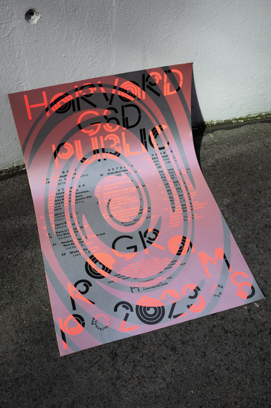
I love this definition, and it’s clear to see how study is pervasive and already happening, and that we’re building a world through the acts of sharing space and ideas with one another (which is certainly something that the public programs and lectures at Harvard GSD become vectors for). So there’s an energy and potential in these notions that I attempted to capture within the poster through a sort of graphic/typographic density, overlap, and cross-pollination. The idea of study can be broad, but it prompted me to think about how I could use the design to reflect a sense of movement, momentum, a gathering of a chorus, a decentering, a deconstruction.
Something that attracted me to your work is that you are not exclusively a graphic designer. You also have a visual arts practice that runs parallel to your design practice. From the outside I can make formal connections between the two but I’m curious what the relationship of these worlds is for you?
These days the relationship is more separate than it has been in the past. Or at least in my conscious mind I’m always “switching” between the two: graphic designer mind and artist mind. Maybe that’s because these two worlds still, to this day, seem like oil and water.
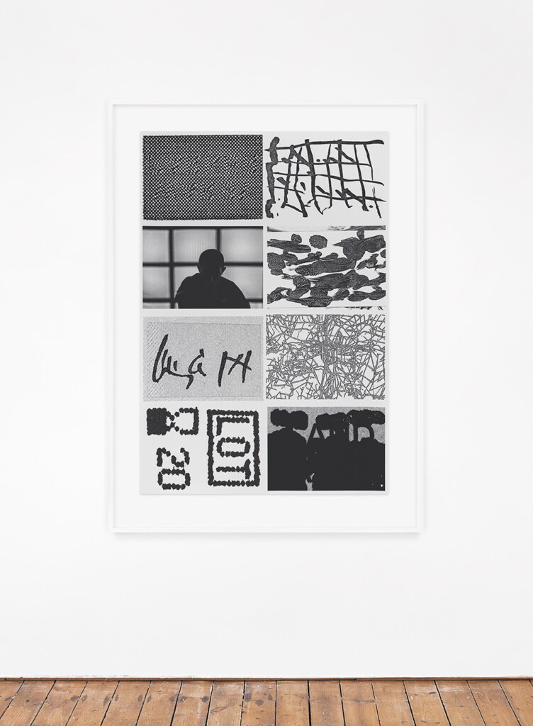
silkscreen print on archival paper, 30 × 44 in.
But if I start to examine things more closely, I can see a relationship between certain approaches or aesthetic sensibilities that I have in both my art practice and my graphic design practice. Like gravitating toward a certain formal starkness or austerity, or a level of high contrast (tonally, typographically, relationally between forms and elements), or even just a very granular level of detail.
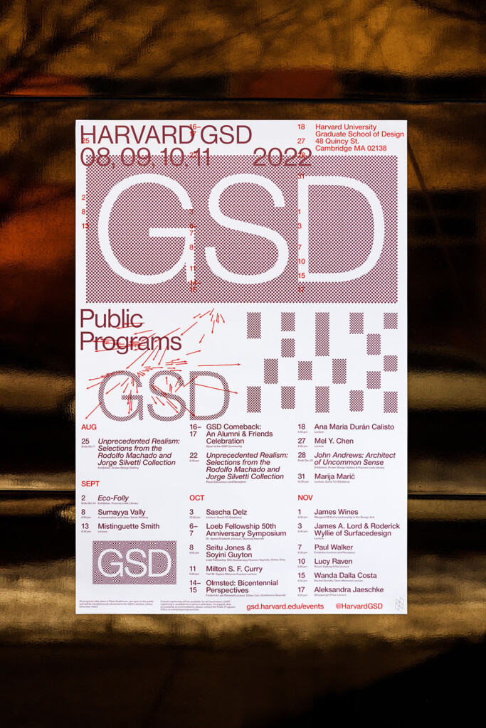
The use of images is crucial to your work—both as a designer and visual artist—and you have specific ways that you use and manipulate them. We don’t have artworks or photographs in our poster, but you have almost treated “GSD” as an image and manipulated its presence in multiple cases. Can you talk about using images beyond their representational value?
I definitely seek out more formal and aesthetic ways to use images, or as elements that feel or act as texture or tone. Or maybe it’s just a desire to use them less conservatively. Having worked mostly in and around the world of contemporary art I’ve often bumped up against the preciousness or strictness that surrounds images. Rules like: no cropping, no altering, no going across a gutter, etc. I understand it of course, but it does make me want to rebel against those rules when the opportunity arises.
I’m also a big proponent of using type as image or type as texture. There’s a very type-centric or type-first mentality that’s pretty firmly embedded in the way I approach design, which definitely pushes me to be more inventive with type and to find certain type moves that can do some of the heavy lifting in terms of conveying ideas and content. That said, I’m often aiming to create typographic moments that feel very integrated (i.e., not just floating or slapped on top), and weighty, and iconic.
Repetition plays a large role in the posters, emails, and related materials for this year’s public programs. How did this come about as a visual device?
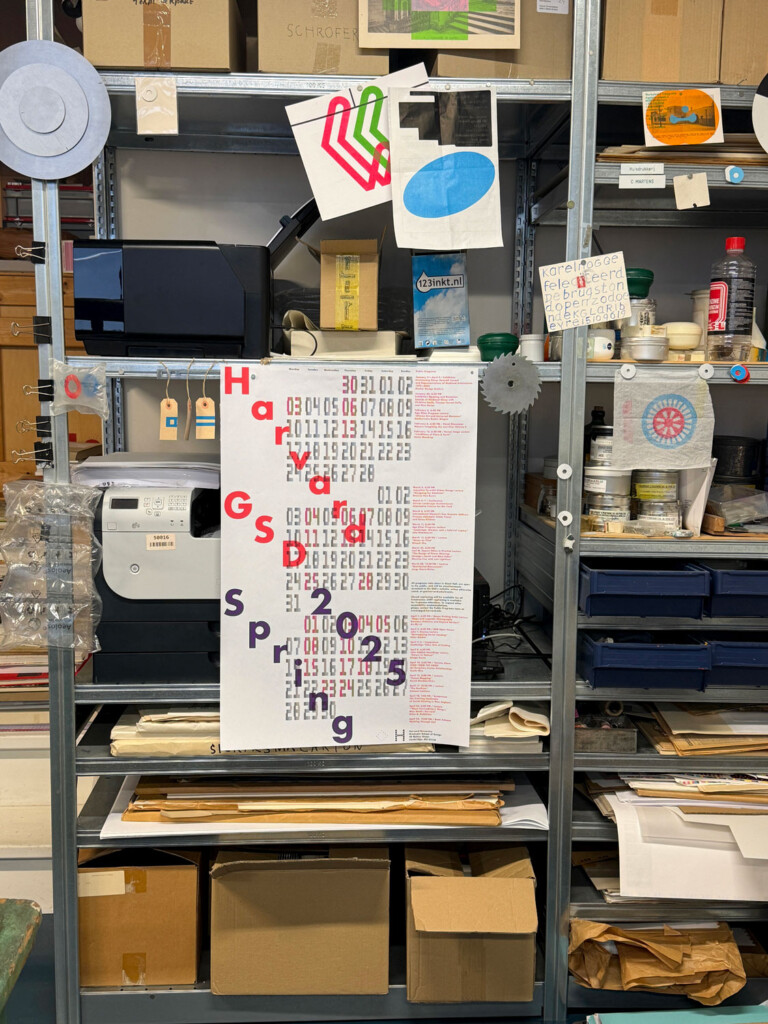
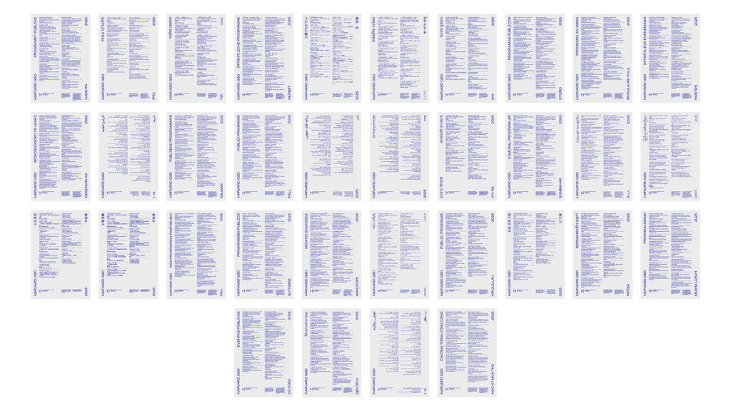
I started using repetition throughout the visual identity as a simple strategy to reference space, scale, and expansion, which of course felt very appropriate for a graduate school revolving around architecture and urban planning.
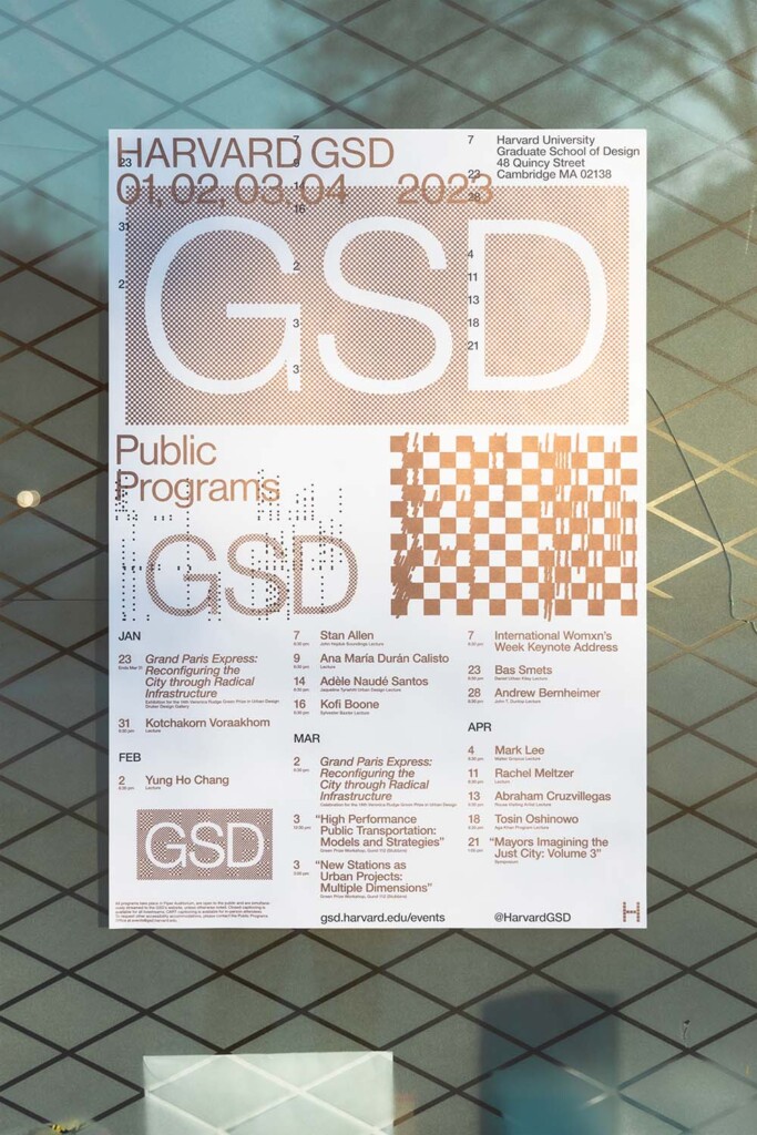
Repetition as a visual device most noticeably plays out within the poster where there are three relatively prominent “GSD” graphics that are descending in scale from top to bottom. I repeated the GSD “tag” not only to establish these different spaces or levels, but also to represent two ideas at the same time: the idea of ascension representing expansion or growth on the one hand, versus the idea of descension representing a zooming or zeroing in on the other.
The vertically stacked grid spaces on the poster also nest with or mirror this structure. Whereas the three “GSD” graphics are descending in scale from top to bottom, the vertically stacked grid spaces are ascending in their column structure from top to bottom starting with the one big “block” column on top, then the two “block” zones in the middle creating two columns, and finally the three columns of listings on the bottom of the poster.
The day numbers from the calendar are also repeated and overprinted on the top half of the poster. The core parts of the poster were already locked in this nesting, symbiotic structure, so I wanted to bring in a similar, connective gesture to reinforce the repetition. In this instance I felt that the overprinting red day numbers become more of a representation of time as a space, presence, or structure.
You have a wonderful sense for type and typeface choices. Even the simplest typeface, in the right hands, can be used to great effect. How do you go about choosing a typeface (our poster is set in Helvetica Neue) and then using it?
I love a simple typeface! To me there are some absolute classics that I would probably be happy to use forever. I feel fortunate that when I was first being introduced to typography that my instructors were showing me the work of a lot of amazing Dutch graphic designers. That had a major influence on me, and I definitely noticed the typefaces they used, the sort of calculated unfussy-ness of their approach to type, and even their loyalty to using just a handful of typefaces for all their projects, or even a single typeface.
Just some of the typefaces I’m thinking of are: Gothic LT 13, Grotesque MT, Univers LT, Akzidenz Grotesk, condensed cuts of Franklin Gothic, more obscure cuts of Times New Roman like MT or Eighteen, Gothic 720 BT, Pica 10 Pitch, Prestige Elite, AG Schoolbook, and of course Helvetica Neue, among many others.
As far as choosing a typeface goes, I like to keep that process simple as well. I think the width of the strokes are a major factor. Sometimes I’m trying to find stroke widths that feel in harmony with other elements like images, content, format, the proportions of the format, etc. But in other instances, it makes more sense for the stroke widths to have a lot of contrast or weight difference in comparison to the other elements. Lastly, I think the letters used in the main title of the design project play a big role in how I make my typeface selections.
With the uppercase letters in “HARVARD GSD”, I’m primarily looking at the “R” and the “G”: both great letterforms that I happen to find pretty irresistible when they’re typeset in Helvetica Neue. With a Helvetica Neue “R”, it’s the curve of the leg. It’s a super elegant curve with a slight outward taper down on the baseline that I think sets Helvetica Neue apart. With the Helvetica Neue “G”, it’s almost all about that downward spur in the bottom-right of the letterform that’s perfectly balanced and gives the “G” such an iconic stance.
Had the main title of this project not included an “R” and a “G”, I’m sure I would’ve chosen a different typeface. It all comes back to content and what you’re working with—even down to the letters being used.
I don’t imagine you have a traditional studio structure as a designer, but the desk-job portion of running a studio is not something they teach in school. Is there any kind of learning curve when it comes to practicing design for clients and what it takes to “manage” a studio?
I think there can be a fairly steep learning curve considering that being an independent or small studio graphic designer can often require you to possess so many graphic design adjacent skills. You might only be working on actual graphic design for 20 percent of the time during a project, while the other 80% of the time is dedicated to aspects like pre-production, editing content, communicating with collaborators and vendors, ensuring quality final production, etc. Like you mention, design schools barely and sometimes never teach these aspects of graphic design to students, but they’re obviously important.
These types of skills tend to live in the background which is probably why they go untaught in design schools and, frankly, are not even spoken about very often. But I wouldn’t trade them for anything simply because skills like these give me the confidence to handle just about any project thrown at me and allow me to focus more on the actual graphic design.