The Design Thinking Behind the GSD’s New Identity
A Language and a Tool
A visual identity is both a language and a tool. The Harvard Graduate School of Design needed an updated language of forms to communicate the School’s mission and values, as well as a tool to facilitate its pedagogical activities and day-to-day operations with a common set of visual standards.
Dean Sarah M. Whiting, in welcoming the GSD community back last year as Covid-19 pandemic restrictions eased, described the School as a place that synthesizes different and sometimes competing frameworks of knowledge. She challenged GSD students, faculty, staff, and affiliates to drive a public dialogue, bringing the knowledge produced at the School to the world.
Conceived this way, the GSD is a dynamic center for learning and discourse. An identity that can help galvanize the breadth of the GSD community and convey the diversity of its ideas must be both adaptable and resilient. It needs to be functional, able to work with everything from large-scale physical signage to social media posts. In every context, the identity has to embody the critical design thinking at the heart of the School.
The University
The GSD is rooted in the broader Harvard University community. Early versions of the School’s identity took the Harvard shield as a point of departure. Right at the turn of the 21st century, the GSD departed from this tradition—and set itself apart from other Harvard schools—by adopting the “Flying H”, designed by Nigel Smith.

The abstracted Harvard “H” projects the dynamic outlook of an educational institution devoted to fostering leaders in design, research, and scholarship.
The School
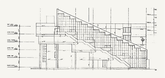
The heart of the GSD is our main building, Gund Hall. This is where the energy associated with learning, teaching, and study is most palpable. In turn, the Trays are at the heart of Gund. This iconic space facilitates the work that happens here.

John Andrews, the architect of Gund Hall, affirmed this importance through his design—the Trays were not part of his brief for the building’s design and are solely his invention. The Trays serve as the backbone of the building. They also define its distinctive form. The physical structure of the building is also the symbolic foundation of the School. In a sense, Gund Hall is a language and a tool: a visual identity expressed in the built environment.
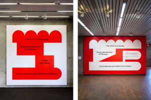
The Structural H
We took inspiration from Gund to develop the new GSD logo. The letter “H” immediately connects the GSD with Harvard. If we strip away the surface of the glyph, we reveal the underlying structure of the letter’s form and composition: its architecture. The letterform foregrounds the features of its own design and construction, just as Gund Hall does. The visual form, derived from self-reflexive inquiry, both embodies and represents the GSD’s pedagogical mission.
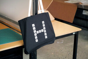
A Multiplicity of H’s
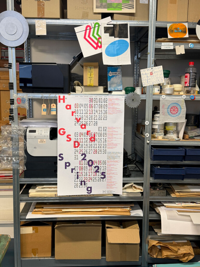
An institutional identity grows and changes over time. The GSD encompasses the multifaceted work that happens at Gund Hall. But the institution is bigger than a building. It is the network of people who put in the work—organizing, teaching, studying, building, communicating, and ultimately fashioning the School in their own unique ways. To be true to the GSD, the structure of the logo needs to accommodate a myriad of creative perspectives. A template of the “H” structure is available to students, faculty, and staff who are empowered to create their own versions of the wordmark.
Typeface
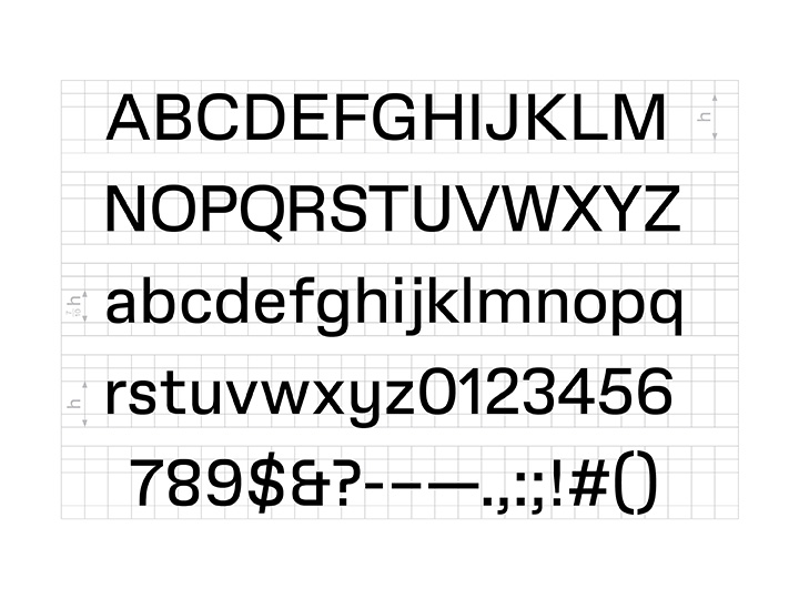
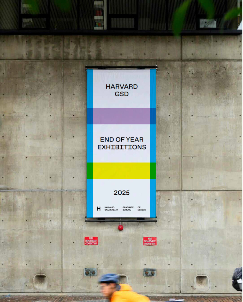
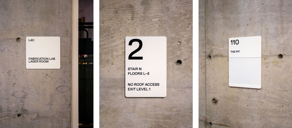
GSD Gothic is both an aesthetic companion to our new logo and a unique means of addressing a wide audience. It needs to be legible in different environments, from signage that feels at home in Gund Hall to dense documents circulating in print or online. It is the workhorse of the identity.
Variable Font for the Digital World
The typeface will exist in two different formats. A traditional format has different weights and styles—that is, regular, italic, bold. GSD Gothic will also exist in a variable format, an approach to typography suited to the digital world.
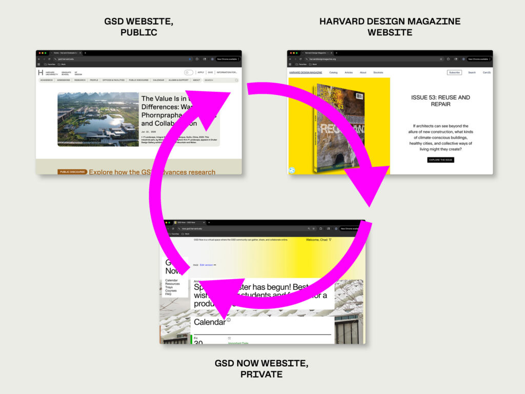
A variable format does not have discrete styles; it can exist in any variable between a set of parameters. This version of the typeface is delivered not in files but in code. It can live on our website and within other digital assets, and it can be programmed to react to dynamic conditions of display.
A System
The logo and wordmark function as separate elements, each addressing different needs.
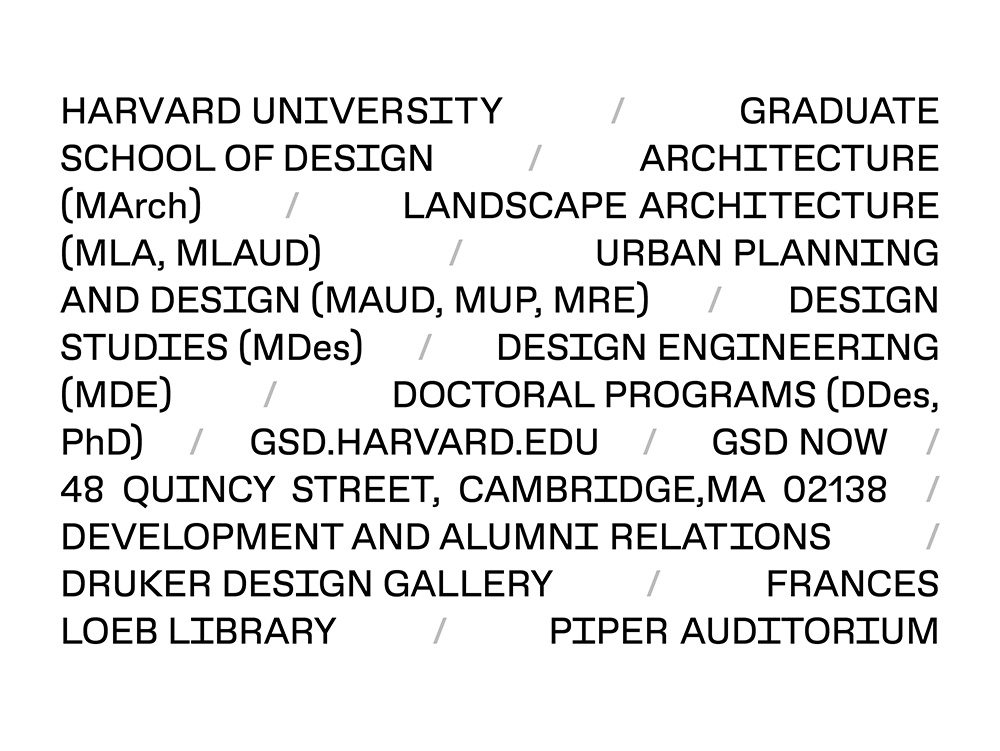
But sometimes they come together. The different elements of this system will be displayed throughout the GSD, online, and in the documents that GSD community members use to correspond with the world.
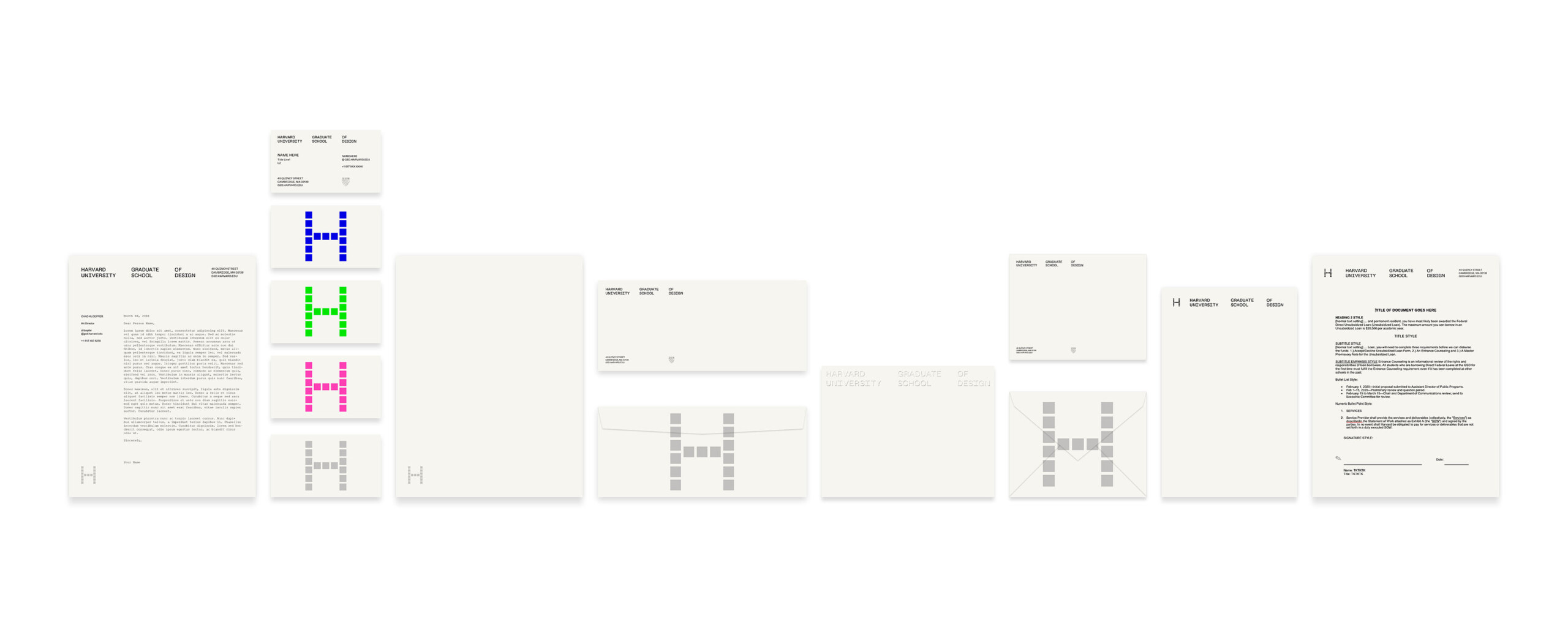
The Harvard Graduate School of Design embarked on its new visual identity in 2022. It was officially adopted in fall of 2022, and since then has been implemented in phases. The GSD’s art director, Chad Kloepfer, designed the new identity.