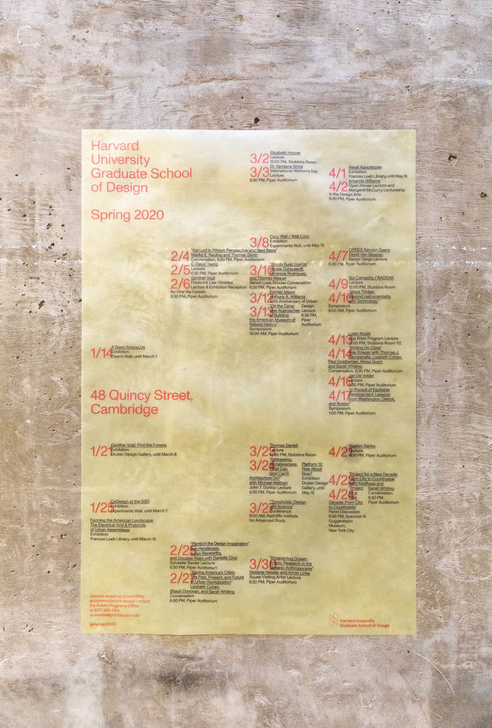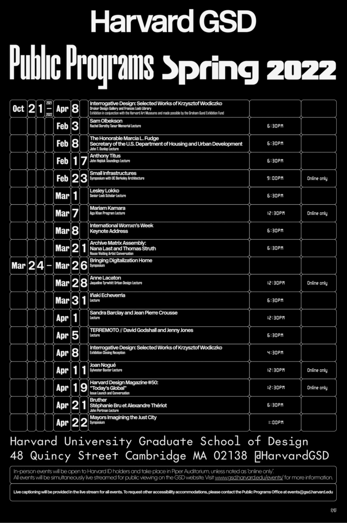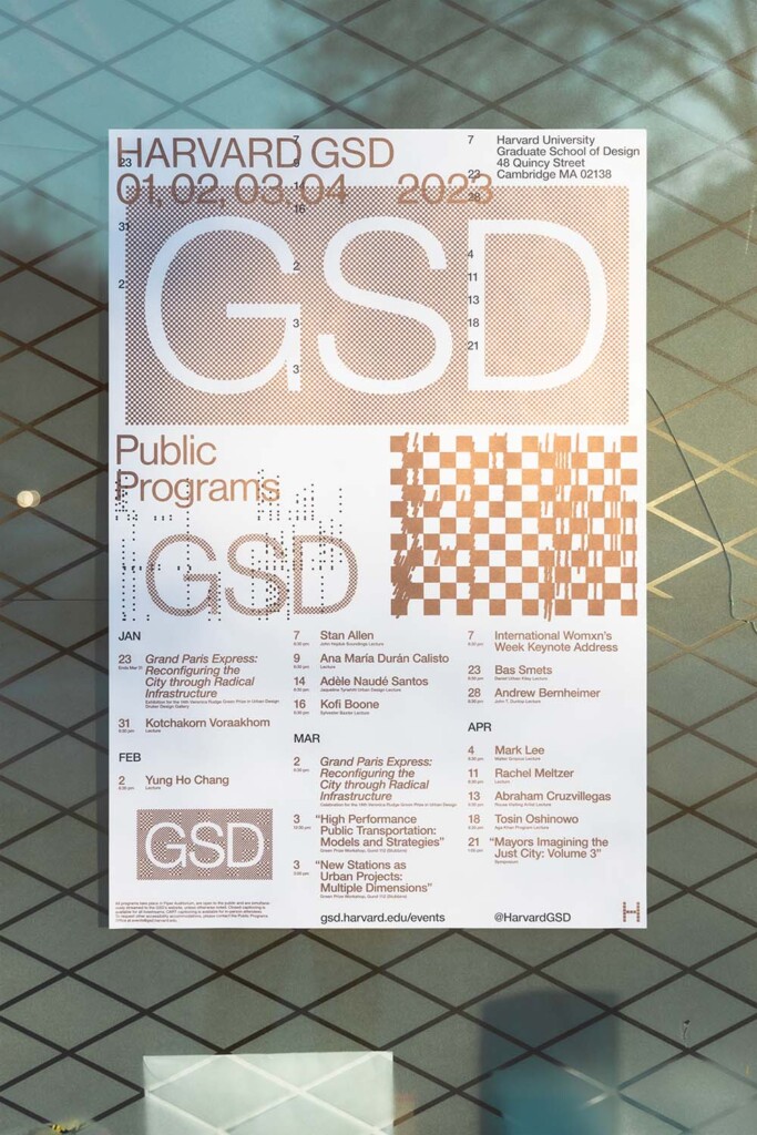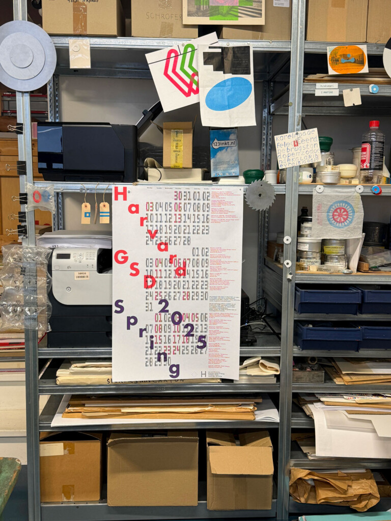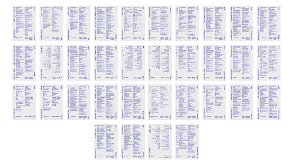
The public program at the Harvard Graduate School of Design features speakers in the design fields and beyond. The series of talks, conferences, and conversations offers an opportunity for the public to join members of the GSD community in cross-disciplinary discussions about the research driving design today.
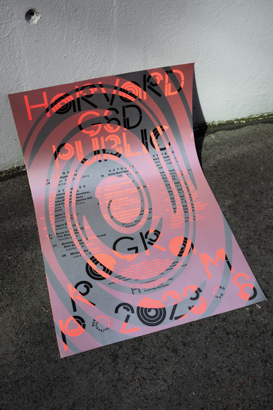
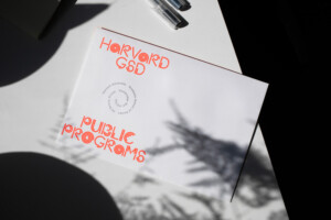
Each year, in an effort to extend an invitation to these programs as widely as possible, the GSD asks graphic designers to create a visual identity that conveys the program’s spirit and mission. For the 2023–2024 academic year, Offshore, the design practice of Isabel Seiffert and Christoph Miler, took up that challenge. They created print and digital materials featuring a swirling motif and a spiral-like typeface that distill the energy and intellectual curiosity of the School’s events. To better understand how graphic design relates to the GSD’s public program, Art Director Chad Kloepfer exchanged questions with Miler and Seiffert over email.
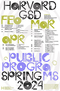
Chad Kloepfer: Through innovative printing and custom typography, this year’s poster is a literal whirlwind of color and type. What did you hope to convey through this treatment?
Offshore: A whirlwind of color and type—that is such a nice description. The graphic language for architecture-related projects often features monochrome or more toned-down and serious visual gestures. Additionally, the pandemic years have felt very monotonous in many ways. We wanted to bring some energy and liveliness to this project. It was important for us to convey a vibrant, dynamic, and, to some extent, action-oriented mood.
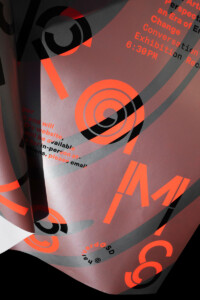
There is a structured but organic feel to both the typeface and layout, the spiral being a predominant gesture. How did you arrive at this graphic device?
During the design process, we were very focused on striking a balance between sharp, clear, and bold graphical forms while allowing movement and avoiding rigidity. To us, this represents a commitment to precision that does not feel “square,” if that makes sense. The gesture of the spiral comes from the idea that this visual identity lives for one academic year, one cycle, so to say. It can be a very intense and dense period, with a lot of things happening at the same time. We wanted to convey that visually.
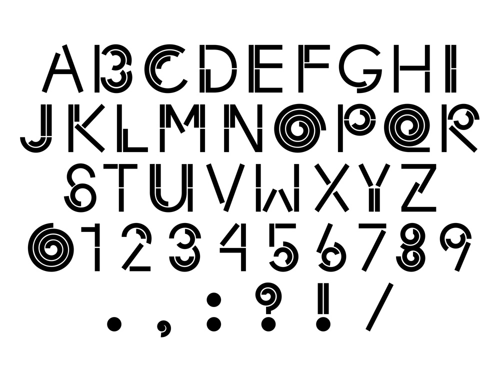
I really love the typeface, especially when the circular glyphs are animated. Can you speak a little bit about the development of this typeface?
There are quite a few typefaces out there that feature spirals in their glyphs. But all of those felt either too retro or too organic for this purpose. We were keen to be precise and playful at the same time–to simultaneously create something very constructed and quite dynamic. We made a few hand drawn sketches to find the general proportions and feeling. We also asked our friend Jürg Lehni, who created paper.js and the Scriptographer plugin for Illustrator back in the day, to create a small spiral tool for us. This made it easier and faster to draw very precise spirals with the parameters we needed for the various glyphs. We hope to extend the glyph set with lowercase and more punctuation later this year.
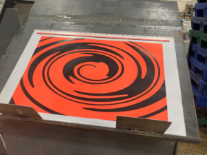
Could walk us through the printing process for the poster?
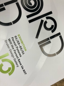
We used offset printing to produce the poster. This gave us access to radiant spot colors, which was essential for creating the vibrancy we were aiming for. The first step was to print the background layer and the big spiral in black and fluorescent red. The silver layer with all the typographic information cut-out was applied in the second step. This way the typography is displayed by revealing the first printing layer, thereby creating a vivid interaction of the overlapping elements.
Something I really admire in your body of work—and this year’s poster is no exception—is how layered it all feels. I mean this both visually and conceptually. Like a root system, we are taking in what is above ground, but it also hints to non-visible layers that are fun to unpack. Could you discuss the conceptual side of your process? What was the thinking behind this public program identity?
The deeper roots of our approach might be found in our latest fascination for the contemporary discourse around time. Today, many artists and writers are challenging the conventional Western idea that history moves in linear fashion. They are emphasizing the non-linear nature of time instead, thinking of history in loops, dialectics, time bangs, and spirals. For example, Ocean Vuong writes in On Earth We’re Briefly Gorgeous: “Some people say history moves in a spiral, not the line we have come to expect. We travel through time in a circular trajectory, our distance increasing from an epicenter only to return again, one circle removed.” We think many of those alternative notions of time are beautiful and fascinating, since they imply a more complex, long-term and intertwined relationship of humans, more-than humans, and the environment. In many ways, these concepts are counter-chronologies, challenging today’s prevalent version of standardized and linear time that serves efficiency, productivity, and a mainly economic perspective on progress and growth. These alternative, nonlinear views on time–some of them in the shape of a spiral–propose a less anthropocentric position, which might help us to synchronize ourselves with a world that is made up of multiple rhythms of being, growth, and decay.
Your portfolio has a striking visual range. Rather than following a set stylistic approach, you seem to generate a vernacular response to the subject matter of each project. What are the underlying continuities within your stylistically diverse body of work?
One underlying continuity within our work is our ongoing interest in multilayered narratives. Stories define who we are, sociologist Arthur W. Franke writes. They do so because they always “work on us, affecting what we are able to see as real, as possible, and as worth doing.” The aesthetics of each project develop from this and similar questions. What style communicates the story we want to tell? What tools do we need to use in order to create the aesthetics we envision? What production processes emphasizes our idea?
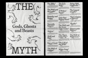
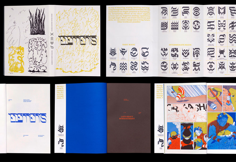
In the last five years, we have built manifold narratives, tackling issues ranging from migration, ecology, and interspecies relations to visual histories and design education. Working with various media—publications, websites, drawings, and exhibitions—we are interested in telling stories in an engaging, often multilayered fashion. Unfamiliar maps, vibrant visuals, symbols that expand and challenge the written language, photography, and illustration can coexist in our plots; they create rhythm, intertwine, and unfold unfamiliar perspectives. We tell stories by exploring, questioning, and transgressing the defined spaces of the discipline of Graphic Design while still staying committed to form, aesthetics, and craft.
One of the projects that brought your studio to our attention is the publication Migrant Journal, which ran from 2016–2019. You were not just the designers of this publication but also helped found it and were co-editors. Can you speak a little bit about what Migrant Journal was/is and what it meant for your studio?
Migrant Journal was a six-issue publication exploring the circulation of people, goods, information, ideas, plants, and landscapes around the world. Together with our contributors, we looked at the transformative impact this circulation has on contemporary life and spaces around us.
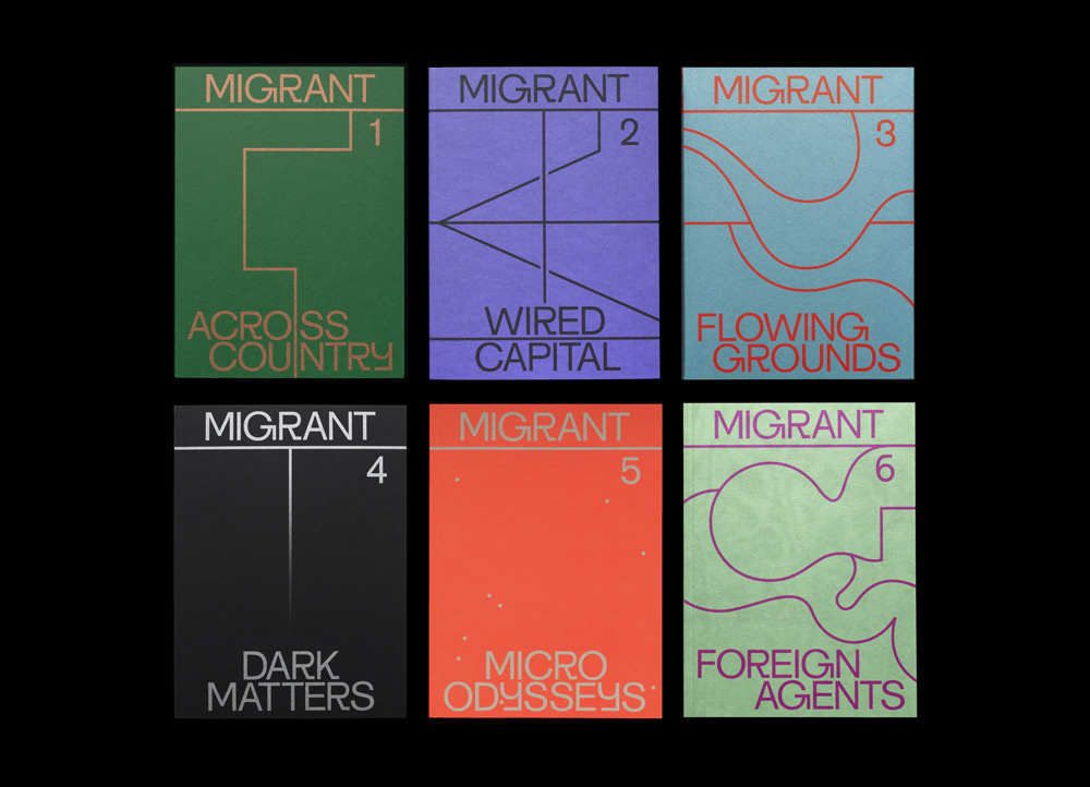
Our endeavor with Migrant Journal has been from the start to look at the world through the lens of these migratory processes—dealing with questions of belonging, national identity, cultural shifts, financial systems, but also landscape transformation, the weather, movement of animals, and global food networks. The idea was born in 2015 when the so-called migrant crisis in the Mediterranean Sea was seemingly the only topic in the news. We felt that there was a huge lack of in-depth information about the complexity of the issue, global interrelations, and the broader concept of migration. In a world of a polarized and populist political climate and increasingly sensationalist media coverage, we felt that it is more important than ever to re-appropriate and destigmatize the term migrant.
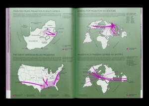
In order to break away from the prejudices and clichés of migrants and migration, we asked artists, journalists, academics, designers, architects, philosophers, activists, and citizens to rethink the approach to migration with us and critically explore the new spaces it creates. A printed journal provided a platform for multiple disciplines and voices to talk about an intensely interconnected world that creates a multitude of interdependent forms of migration.
The decision to produce a magazine, and not make a website or a book, was purposeful. We strongly believe that printed publications can create a reading experience that lasts longer than most ephemeral bits of information on the internet. As soon as it’s online, it’s lost in the stream of information, and we didn’t want this. Print is still the technology that ages better than any other carrier of information.
Maps are an integral component of migration. They are all about movement, territory, and space. So it felt very natural to use the technique of mapmaking as a narrative tool for our publication. Maps, as one major component of Migrant Journal, are woven into a diverse set of editorial formats, like essays, images, infographics, reports, and illustrations. Through the materiality of the object we were able to translate complex issues into a format that provides various points of entries in a multilayered manner.
It’s our founding project and has heavily shaped our way of working in many aspects of the practice. At the same time, it defined our studio profile and influences, until today, the projects for which we receive commissions.
