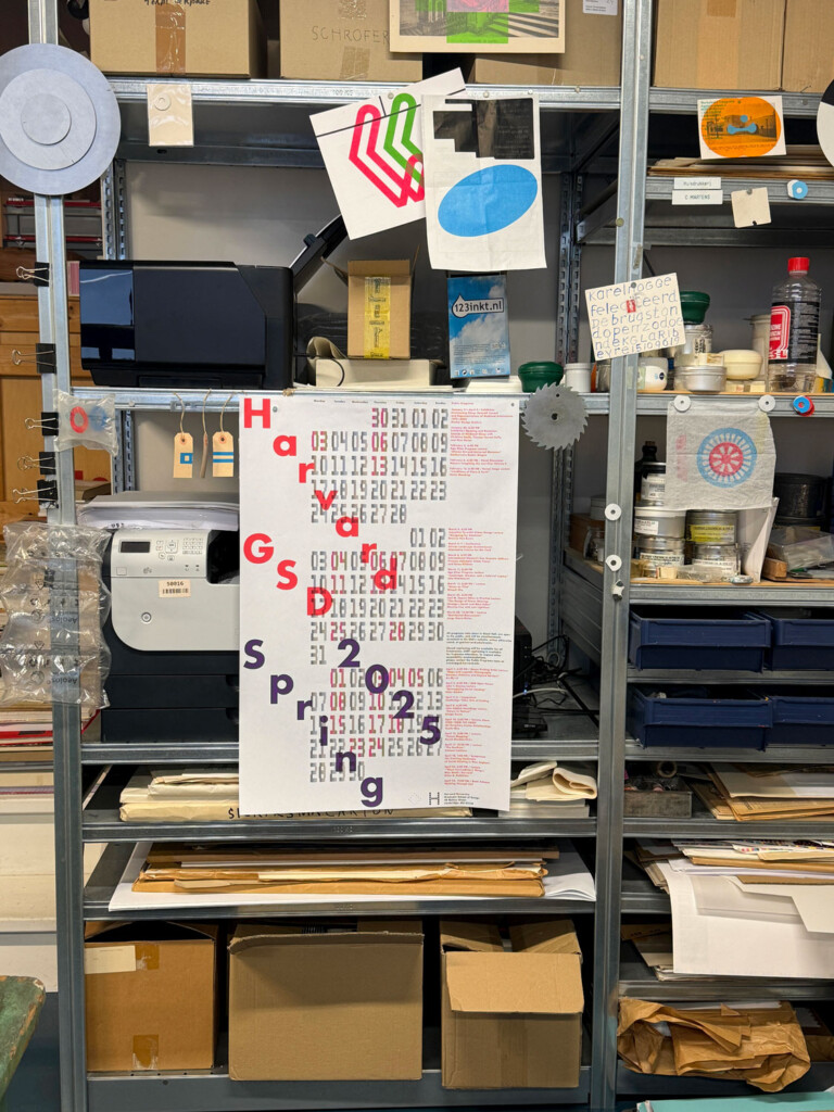
 Commissioned annually or seasonally, the Harvard Graduate School of Design Public Programs poster is an opportunity for an illustrious designer to bring a unique vision to the project of featuring and promoting a series of public talks, while also representing the ethos of the GSD community. One poster publicizes the full series, and additional posters give details on specific speakers and events, together using visual language to emphasize a cohesive series, and expressing the artist’s perspective on the entire program.
While the designs have all served to present the program’s calendar, they have offered highly distinct perspectives. Often inspired by the themes and content of the featured talks, the concepts behind each poster are shaped by the vision and particular approach of each artist. But they all share a commitment to the power of paper. While digital ads and e-mail promotions inundate us every day, the paper poster brings us back to the material world. It takes into consideration time and space as physical fabric, and provides a break from the abstract glow of our screens. In turn, the community is encouraged to join in on the public events, interacting face-to-face with designers.
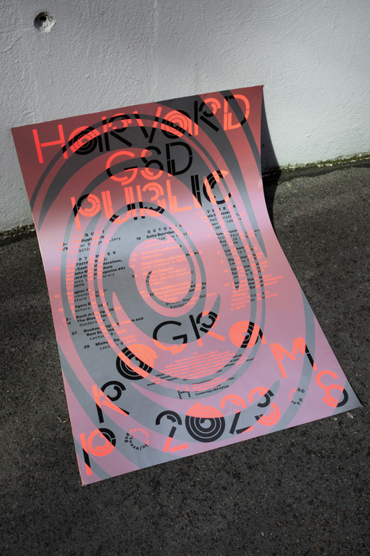
This spring, the program is promoted through a design that offers minimalism with a wink. While clearly communicating key information about the series, the posters also offer layers, friendliness, and space for reflection. They are intended to preserve a “human moment,” says Maricris Herrera, founder and creative director of Estudio Herrera in Mexico City. We’ve invited Herrera to discuss her pieces and explain how they came to be. She tells us about how her background in architecture informs her graphic design, explains why she sees content as the driving force behind design, and defines the relationship between substance and form.
How would you describe your vision for the poster designs?
The first thing we did was to take a step back from the traditional idea of a poster saturated with images and information. Our initial question was: how can our posters draw the attention of the person standing before them? We decided that our starting point would be to focus on production and printing techniques, putting aside formal and aesthetic decisions until later. Our goal was to generate visually attractive solutions from a technical point of view.
How did your varied background in design (architecture, books, fashion, and more) inspire or inform the posters? What kinds of tools do you use to experiment with your ideas and express them?
I approach any concept through architecture. I was trained as an architect, so I never overlook conceptualizing under the three-dimensional premise. Regardless of the fact that graphic design is considered a single plane practice, any project takes up time—and time happens in space as a fourth dimension (x, y, z + time).
My sources of inspiration are the contents themselves. That is why my work’s starting point is always classification, and takes on construction later. Positioning and understanding the contents as an essential part of an invisible framework supports a visual narrative.
GSD commissioned a project for a time-based document—it needs to communicate a series of events that will happen over a determined period of time. Ultimately, it will also serve as the documentation and archive of something that happened, like a diary. To think of becoming a part of history is one more concept that I could add to the “background” of my graphic design practice.
What role does erasure play in the design?
I always mention the deliberate “lack of design” in my work; that phrase is my lifesaver when I have to explain myself. And I’m only now realizing—as I read your question again—that it is indeed a deliberate explanation.
That “lack of design” means that the contents are of utmost importance to me. I take them into consideration before even considering showing my own work. My focus is on depicting them as clearly and in the most reader-friendly way possible. The information leads to the design and not the other way around.
Once again architecture finds its way—it’s substance versus form. Here’s how I see the relationship between the two: substance is what we say, and form is how we say it. Form is a cover letter, a first impression of undeniable importance. The role of the design—the form—is subjective, and therefore risky. I once read something along the lines of, “If you don’t have anything to say, don’t say it at all, because no matter how witty you are, or how dark your metaphors can be, the reader will eventually close your book.” I’ve taken that advice to heart because the same thing happens with graphic design. The advice translates to: don’t design what doesn’t need to be designed. In my case this applies to information; my role as a graphic designer is simply to understand the information and know how to contain or display it.
What does negative space reveal?
In graphic design, negative space is present, meaning that the time when nothing occurs is just as important as when things actually happen. So, the “dead times” become spaces for reflection that allow us to process the information. That is why I found it so important to depict an actual timeline that is impossible to break, whether something happens or not.
Why did you use transparent cellulose paper for the poster?
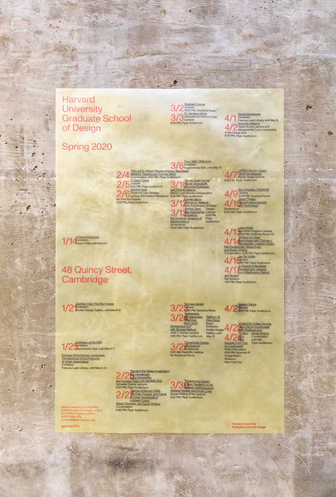
It allowed us to work in layers and to structure the contents according to their unmovable position in time. In this case, there is a grid that indicates what exists and cannot be modified: it shows time—in months, days, and hours. This will remain in its corresponding position in all the applications, and is printed in reverse on the back side of the paper. This first “layer” appears in orange on the program as well as on the individual events. In the front, as the other layer of time, the GSD seasonal program is printed according to—and overlapping—the fixed months, days, and hours.
By taking advantage of all the spaces available on the paper (front and back), and thanks to the see-through option that we selected, we had the opportunity to create a visual effect on several dimensions. It’s hard to believe that the simple printing of a paper can have that effect . . . but it’s quite true. We also printed a bunch of tests, which allowed us to confirm that our original idea could actually be translated from the digital window to reality and become a space itself.
Your style could be described as minimal and tidy but also playful. There is always some kind of a surprise. For example, the design has a sort of hidden grid, but it gets interrupted by a little hand-drawn clock at one point. You seem to like adding elements that are lighthearted and friendly. Why is that important to you?
In this case, my response is actually implicit in your question. It’s more than just playful moments in our design . . . something that is always present at Estudio Herrera is a good mood and a good sense of humor (at least I like to think so). In a way, it’s a matter of personality and compatibility among team members. We are minimalists—orderly, friendly, and with a twist of fun—that’s how we dress and that’s how we behave. Whether we manage to reflect that in our work or not, it is not something we do consciously, it’s just the way we are.
We like to call it el guiño de remate (the top-it-off-wink). It’s about seeking and maintaining the “human moment,” so that we can understand and flow—not only as a team, but as human beings. It gives us a certain freedom.
When designing the poster, did you think about how to make it stand out against a sea of other posters, or in a visually cluttered space? What were some other challenges of designing this particular piece?
Rather than trying to stand out, it became clear that the value of our proposal lay in the fact that it was respectful toward other posters and their information. The transparency allowed for whatever was underneath it to remain in sight, instead of obscuring it altogether. The underlying sign would probably be of a recent event or an upcoming one, so the fact that it is still visible means it’s still valid.
The challenge was to design something without a preconceived concept. As my practice is focused on art and culture, I generally receive content loaded with concepts, and that is why I always insist at the studio that our goal is “only” to create structures that contain, support, and justify what comes next: design. We fret about content. We see our role not only as designers, but as art directors as well.
To me, this project was more of a collaboration than a commission. It’s not about communicating the design, it’s about communicating a prestigious program with an objective—and graphic design is only a tool to achieve this.
The full public program can be viewed on Harvard GSD’s events calendar. Please visit Harvard GSD’s home page to sign up to receive periodic emails about the School’s public programs, exhibitions, and other news.