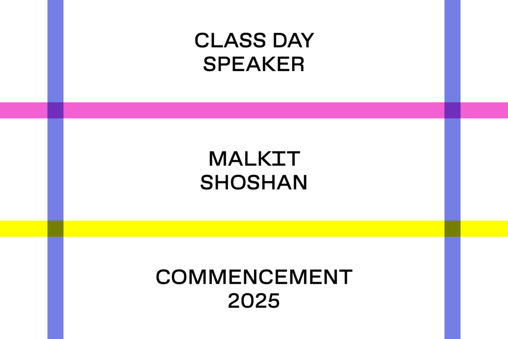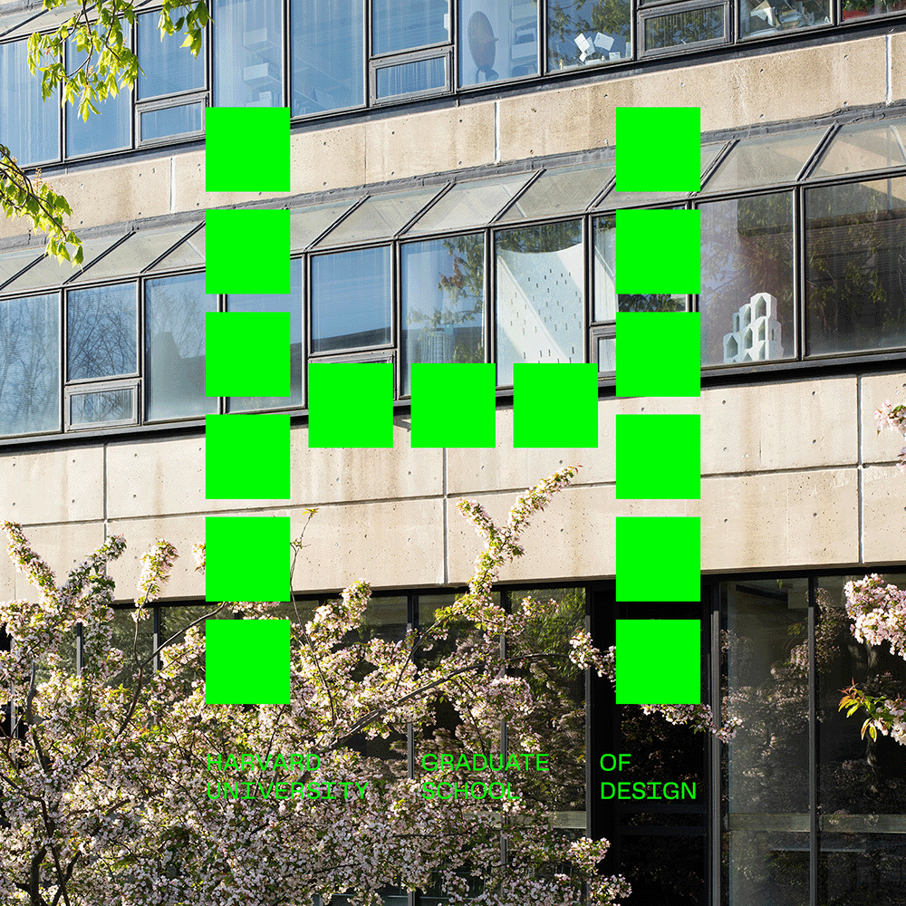
Each year, the Harvard Graduate School of Design (GSD) creates a visual identity for commencement exercises and related events and exhibitions. This year’s design, developed by art director Chad Kloepfer and graphic design consultant Willis Kingery, uses color to define grids of varying widths that frame text in GSD Gothic, the School’s custom typeface. The pattern appears on tickets for commencement events, exhibition title walls, banners throughout the school, and website graphics.
For the past several years, the commencement identity has utilized formal graphic treatments: repeating forms, eccentric shapes, and geometric patterns. In 2024, for example, the design featured off-cast forms found in the trays. Moving in a different direction for the Class of 2025, Kloepfer chose to emphasize color.

Seeking to “deploy color in a meaningful way,” Kloepfer and Kingery devised each grid pattern with a “core color” linked to the GSD’s identity system. The School’s signature green, pink, blue, and yellow anchor the rest of the color choices in a given iteration, with the designers working toward a harmonious palette. The visual identity leads to surprisingly complex results, especially in areas where bars of color overlap, creating a woven effect. Some of the title treatments for end-of-year exhibitions in the Druker Design Gallery, for example, feature a combination of translucent tape and paint to achieve the right intensity of color where the vertical and horizontal elements of the grid meet.The grid structure was inspired in part by tartans, distinctive woven patterns created by intersecting strips of varying width. The specific variations of color and weave in tartans have historically carried symbolic meanings. In architecture, the “tartan grid” refers to a grid system where the vertical and horizontal elements are not necessarily aligned or spaced evenly. The irregular features of these patterns create a sense of dynamism, whether in space or textiles.

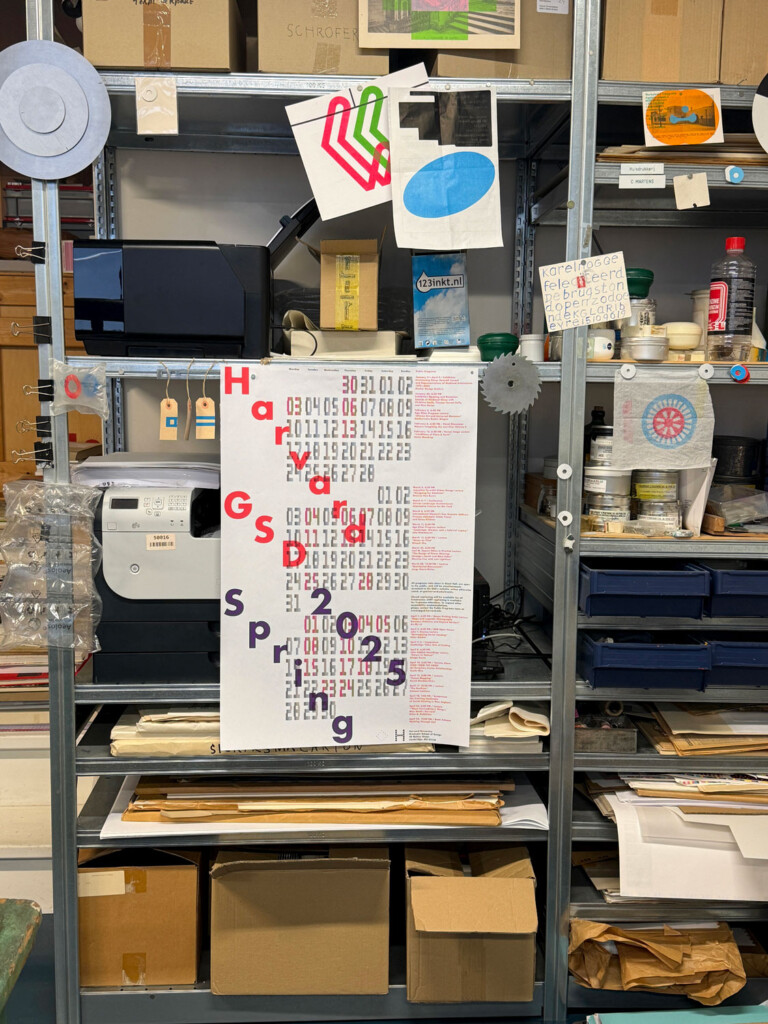
Another inspiration comes from Karel Martens, the Amsterdam-based designer who developed the visual identity for the GSD’s public programs for the 2024–2025 school year. Marten’s monoprints in particular, on which two colors overlap to create a third, served as a point of reference for Kloepfer and Kingery. “The monoprints are all about time,” says Kloepfer. “The ink dries and then you can print again a day or two later. It’s a beautiful way to work in our era of high-speed.”


