How a Design School Designs a Website
The Graduate School of Design’s new website offers a tool for the School community and new platform for design discourse for the wider public.
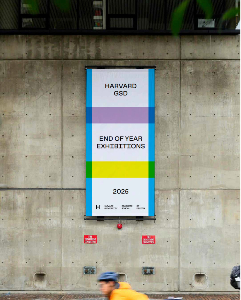
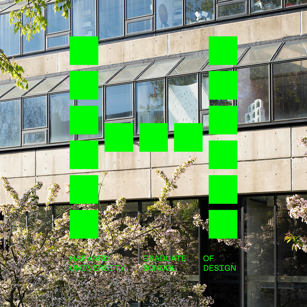
Visitors to the new website that the Harvard Graduate School of Design launched at the start of the 2025–2026 academic year likely noticed first its updated look, which aligns the GSD’s digital presence with a visual identity released a year earlier. With further exploration, however, they would discover a more fundamental shift. The new site represents a comprehensive rethinking of how the GSD presents information about everything that happens at the School—from courses and studios to faculty research, student projects, events, and exhibitions. Above all, the redesign elevates discourse about design, foregrounding the ideas the School produces and encouraging broader public engagement.
As an academic institution, the GSD is a place where different—sometimes competing—forms of knowledge coexist. The School comprises three departments, 17 degree programs, and numerous administrative offices that support them. Design, as taught in Gund Hall, can mean cultivating new bio-based construction materials, mapping the effects of sea level rise, crafting policies for urban growth, or modeling complex real estate finance transactions.
The GSD’s strength lies in its interdisciplinarity, a pedagogical approach that invites complexity. By making that complexity navigable, searchable, and legible, the website extends an invitation to discover more, encouraging the exchange of ideas beyond disciplinary silos. As the outward face of the GSD, the site prioritizes that invitation, making the case—in both form and content—for the relevance of design in shaping the world.
Discovery
Understanding the needs of the GSD community—and the ambitions of a redesign—required an extensive discovery phase. This process was led by Veronica Bagnole, digital project manager at the GSD, in coordination with Other Means , the Brooklyn-based firm selected to design the site. Through interviews and workshops with representatives of the faculty, staff, students, and alumni who knew the School best, the priorities for a new website came into focus.
“A central focus of this project was rethinking how users find content on our site and how we could improve that experience,” said Bagnole. “Before we could think about the visual design, we concentrated on creating a more intuitive user experience—improving functionality and structuring content so visitors can quickly find what they are looking for.”
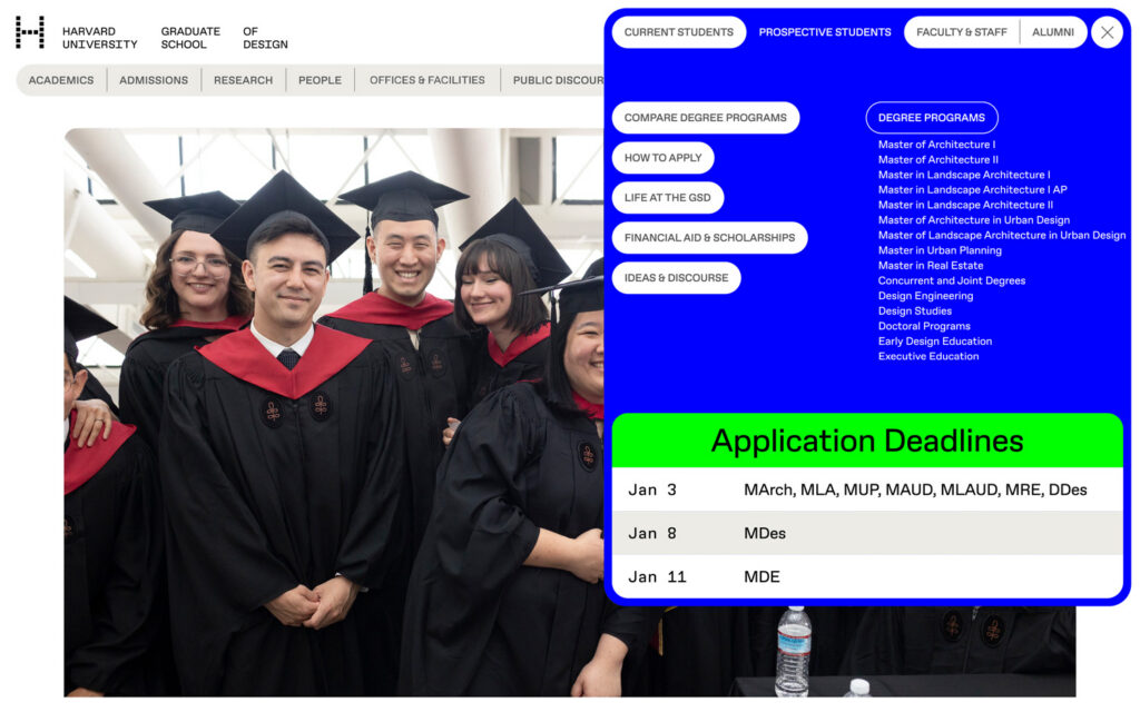
The team identified three core elements integral to the redesign. The site had to facilitate the operations of the academic institution: it needed to be an indispensable tool for finding room assignment policies, course schedules, and instructions for operating equipment in the FabLab—everything that keeps the institution running. At the same time, the website needed to reach a broader community. Prospective students are a key audience, so features such as a degree comparison tool were deemed essential to introduce the GSD’s array of academic offerings. Representatives of the GSD also wanted the website to do more than support academic operations—it had to foreground the ideas produced at the School, most directly through editorial content.
The mandate, then, was to deliver streamlined paths for users to find the information they need while also opening avenues for members of the GSD community to discover more—and for the wider public to gain new insight into how design shapes everyday life.
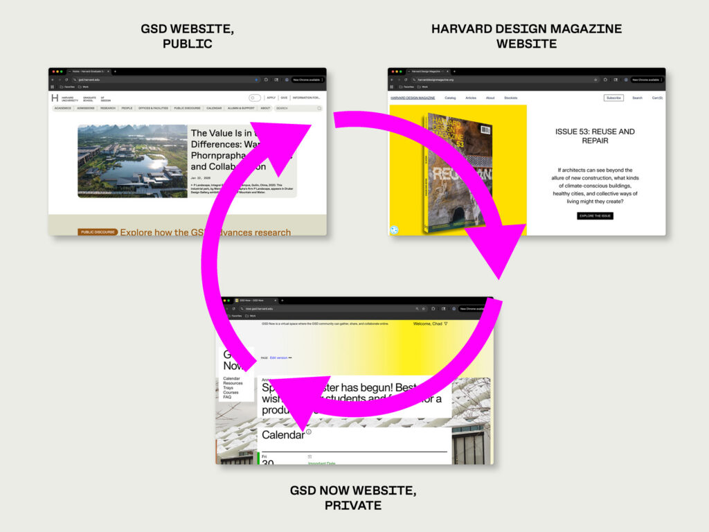
To accomplish this, the team made the crucial decision to create an enhanced Resource Library, now integrated with the flagship site. The School already maintained an internal website, GSD Now, designed by Tomas Celizna, which functioned as a virtual hub for the day-to-day life of the community, featuring schedules, key dates, and collaborative platforms. To complement it, a new platform—GSD Now Resources—was developed by the firms 10up and Cite to house the information, policies, and manuals on which each segment of the community relies, including materials protected by HarvardKey for internal use. By consolidating information intended solely for the GSD community within an expanded GSD Now ecosystem, the main website could more fully address external audiences.
Information Architecture
Developing a system for organizing and presenting information to the public provided the framework for the rest of the design. Central to the project was the creation of an improved tagging system that could be applied consistently across the site. With coherent metadata, content produced by any of the School’s departments, offices, or research labs can appear in the appropriate place—and alongside related work that might otherwise remain siloed.
“With so many different but interconnected content types, we prioritized structure and clarity when creating our information architecture,” said Bagnole. “We use consistent tagging and clear signposting to show relationships between content, supported by a thoughtfully designed navigation system: a custom megamenu, an info-for menu, layered subnavigation, and optional tables of contents on individual pages.”
To give visual structure to the information presented on the site, Other Means began with the navigation menu. “It’s the thing that gets the most wear,” said Ryan Waller of Other Means. “If you’re an interior designer, you might start with the chair and build outward. The navigation bar is also one of the most complicated elements to design across different screen sizes. Once you solve how the navigation functions at various breakpoints—and give it a clear conceptual logic—that establishes rules for the rest of the site.”
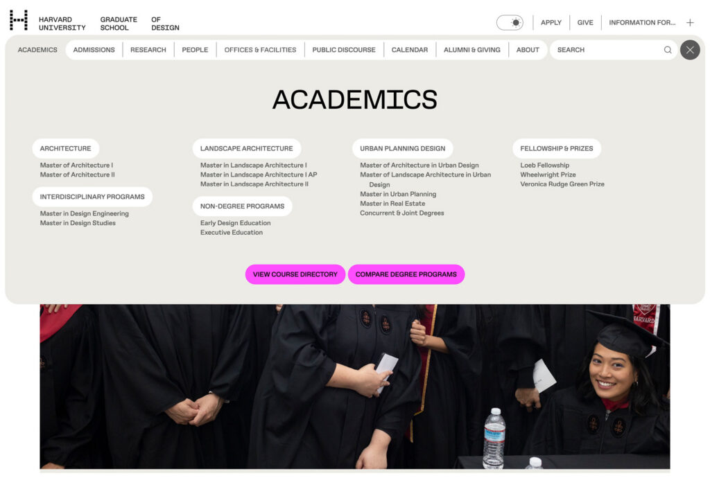
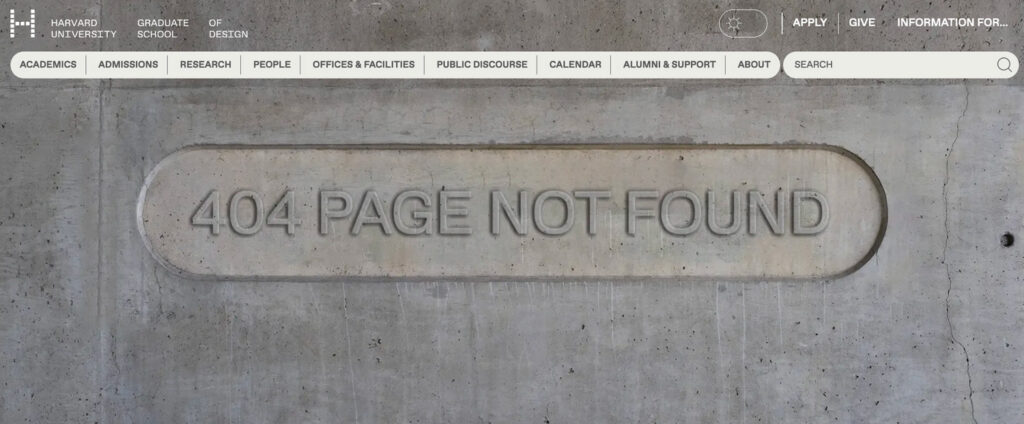
With up to nine categories in the main navigation bar, each containing multiple subcategories, the challenge was to provide immediate access to sought-after information. One solution was the megamenu, which allows the navigation bar to expand with a single click, instantly revealing all subcategories.
Developing the navigation system generated other aspects of the visual design. “If a navigation bar fits at a certain scale, that suggests a type size that might feel comfortable elsewhere,” Waller said. “The margins established there become a reason to use certain proportions throughout.” In this way, the information architecture shaped the navigation, which in turn established a system of visual rules for the rest of the site.
Visual Design
“The visual design needed to be extremely flexible—to keep the GSD’s information organized, modular, and capable of growth, while accommodating a top navigation with nine distinct entry points,” said Lubliner. At the same time, the site reflects the School’s new visual identity, designed by art director Chad Kloepfer.
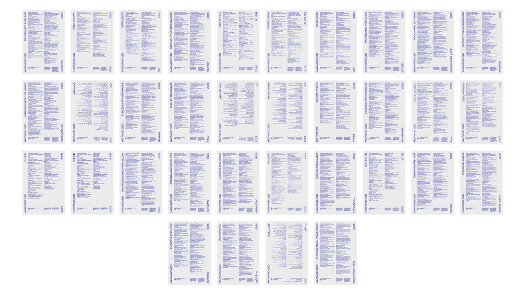
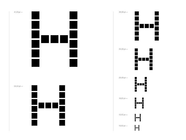
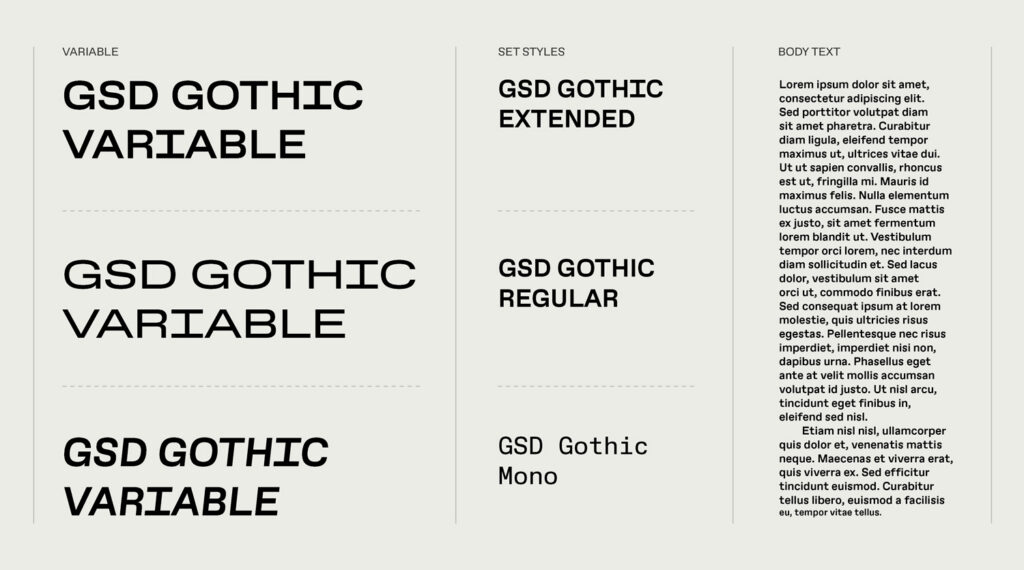
In developing that identity, Kloepfer drew conceptual lessons from the physical architecture of Gund Hall, which exposes its essential structural elements. The flexibility of the system extends to GSD Gothic, a variable typeface capable of shifting fluidly within a defined range of parameters rather than adhering to a fixed set of styles.
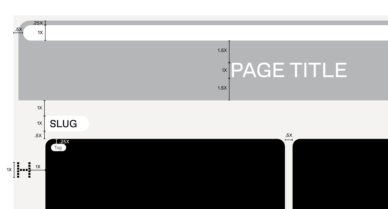
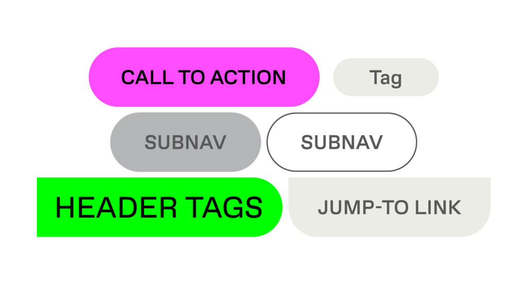
Other Means applied the principles structuring the GSD’s identity to the digital environment, paying close attention to an underlying grid flexible enough to accommodate diverse content and evolve over time. The basic building block of many pages is the “card,” which combines image, text, and metadata into a single unit and can appear in multiple contexts across the site. Rendered with rounded edges, these cards lend a sense of physicality and playfulness, counterbalancing the rigor of the grid and making the institution feel inviting.
The discovery process revealed little appetite for the merely unexpected—novel or gimmicky features that loudly announce “design.” Instead, the goal was to demonstrate design excellence through performance: how well the site works. The visual design also reflects the School’s values in quieter ways. A high priority was placed on creating a dark mode, both to reduce energy consumption and to advance sustainability goals.
“Information architecture informed the visual language through the necessity of creating a comprehensive system of user interface elements,” Lubliner said. “The system had to communicate—consciously or subconsciously—what each element does: this type of button performs this action; this color signals that function.”
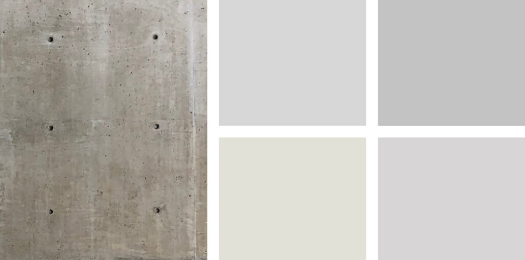
The site’s colorways reinforce its information design. Specific gray tones that form the background of many pages derive from the concrete of Gund Hall—a subtle nod to the School’s physical campus. A coded system of buttons and tags introduces controlled bursts of color consistent with the identity system: blue for information, yellow for alerts, green for calendar items, and cyan for calls to action.
Public Discourse
When welcoming students at the start of each academic year, Dean Sarah M. Whiting often underscores the relevance of design to public life. “We synthesize knowledge from across the academy and the public and private sectors to distill the most relevant and effective ideas into an innovative design,” she has written, describing this as “an effective public process, or generative history—always responding to the complex circumstances of a place, its community, and its future.”
To better highlight the design research and practice happening at the School, the new website positions Public Discourse as a highly visible section. By gathering exhibitions, publications, and public programs in a single location, the site creates new entry points into the world of design for audiences beyond the GSD.
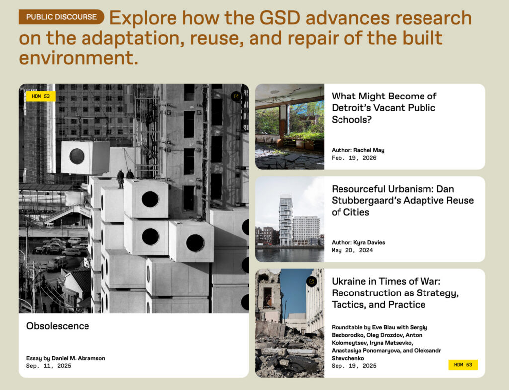
A major component of this effort involved integrating Harvard Design Magazine’s standalone digital presence into the main GSD website, a process facilitated by 10up and Cite. This integration allows the School’s flagship editorial project to appear seamlessly on the homepage and throughout the site.
In an era when many people access information primarily through standalone apps and social media, the GSD chose to invest in a robust core website in part because of its public function. “Websites can serve better as public records and sources of truth,” as Lubliner put it. They are among the closest things we have to a global public square. For an institution like the GSD, presenting itself in fragments across social platforms is not enough. The website had to match the GSD’s ambitions around comprehensiveness—course schedules, degree comparison tools, and extensive public offerings about the relevance of design for the world at large.