How John Andrews and Daniel Buren Inspired the Graphic Identity for the GSD’s 2026–2027 Public Programs
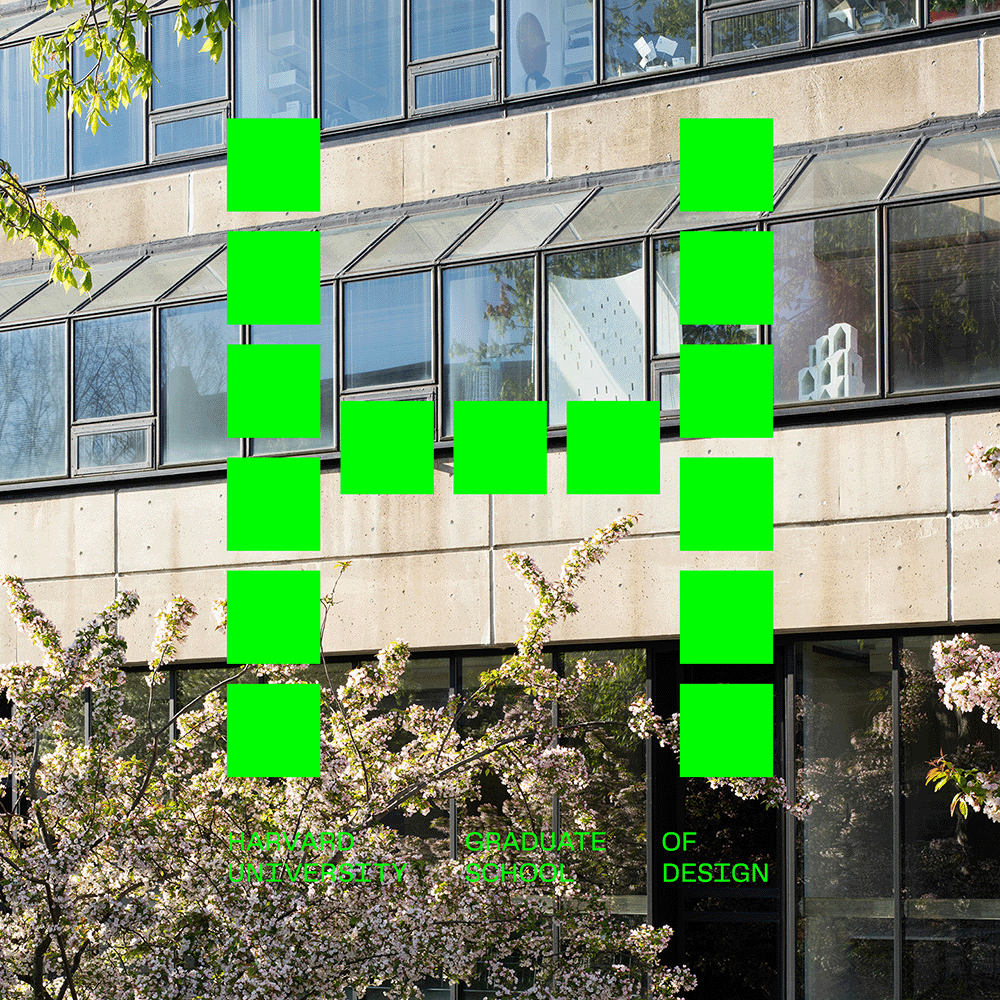
Anyone approaching the Harvard Graduate School of Design’s Gund Hall along Quincy Street may find themselves enveloped by a dramatic colonnade. With towering round concrete columns supporting tiers of offices and classrooms overhead, the building’s architect, John Andrews, defined a porous boundary between the public street and the footprint of the GSD’s main academic building.
Though most of the columns are regular in width and spaced at even intervals, some variations exist. Since Gund Hall opened, in 1972, one trio of columns near the building’s northwest corner has attracted particular attention, sparked internal debate, and caught the eyes of passerby for its striking irregularity that creates a playful, off-kilter rhythm.
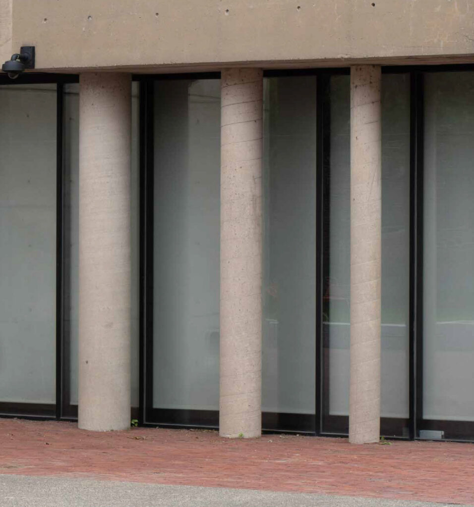
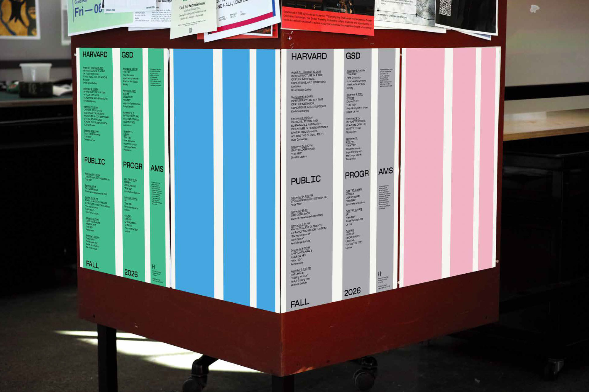
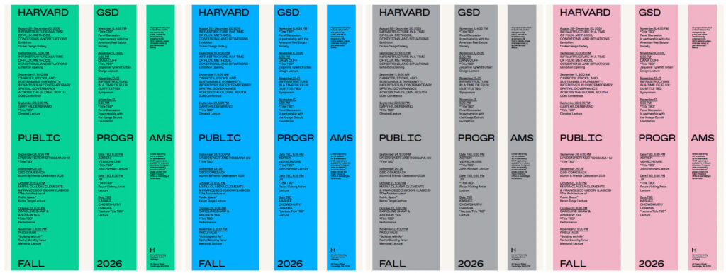
These columns served as a touchstone for the visual identity designed for the GSD’s 2026–2027 public programs by Chad Kloepfer, art director at the GSD, and Willis Kingery, design consultant. The primary expression of the identity is a poster listing the GSD’s exhibitions, talks, and other programs against a trio of vertical, monochromatic stripes of varying widths and intervals. The posters are printed in four versions, each in a different color. Blank stripes printed on the reverse of each poster transform the sheet into a modular unit that can either display information or serve as part of an architecture-scale pattern hung throughout the building and in other public settings.
Designing the identity for the public programs is, “one of the hardest design assignments,” says Kloepfer. “We always think about the school as a space, whether that’s a physical space or a social and cultural space.” For the 2025–2026 academic year, the student body provided the point of reference. The information on the poster was translated into the primary languages spoken by GSD students, and more than 30 resulting versions collectively embodied the School’s international makeup.
This year, Kloepfer and Kingery returned to the physical setting of Gund Hall. “We’re always thinking about ways that the spatial can get translated into the two-dimensional,” says Kingery, describing a strategy that Kloepfer also pursued in the GSD’s overall identity.
For Andrews, the columns were integral to a forward-looking approach to the building. He felt that the future needs of design education would be impossible to predict. A structure organized around columns rather than walls could remain more adaptable.
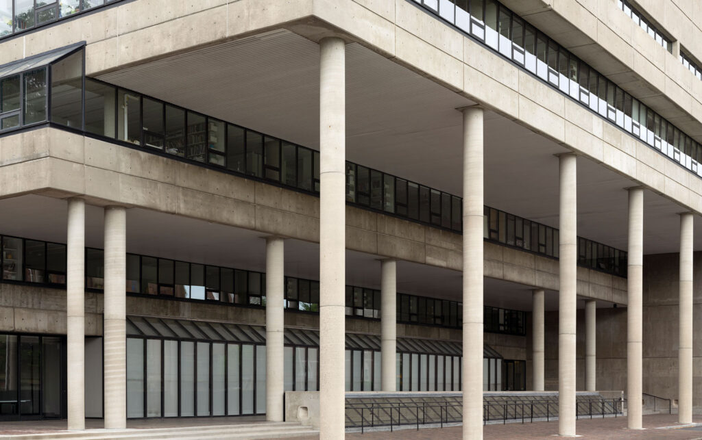
“Even though the columns may be a product of a rationalist, or functionalist logic,” says Kingery, there is an interesting quirk to them that generates a lot of interest.” Kloepfer and Kingery brought a similar tension between system and irregularity to the poster design. “If we had made this poster with even columns, it would be static and lifeless,” continues Kingery. “I think that Andrews was right to have moments of variable spacing; there’s something charming about it.”
By highlighting the trio of variable columns, the designers draw attention to a seemingly minor moment in the building’s architecture that has nevertheless become a focal point for debates about its design. Mark Lee, former chair of the Department of Architecture, has described the interpretation of Andrews’s design as a kind of “chess game” among architecture faculty members: Are the columns elements of a functionalist system, decorative features, or some combination of the two?
“We are not trying to represent the columns as three-dimensional forms with shadow and space,” says Kloepfer, “but as flat graphics. Columns become stripes. And once we make that transition, they can work as containers for information.” The posters carry information but also, in turn, become physical elements within the School. Their reproducibility is key: each poster is conceived both as a discrete object and as one unit within an architectural-scale pattern that can unfold across the building and into other public spaces.
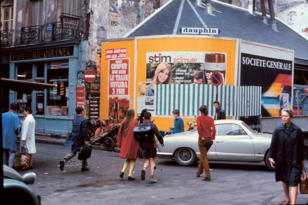
Graphic design thus becomes a tool not onlyfor communicating a schedule but also for what Kloepfer calls the “activation of public space.” Here, the work of Conceptual artist Daniel Buren offers a point of reference. Buren’s characteristic stripes were conceived in relation to the public spaces in which they appeared; rather than functioning primarily as autonomous objects, the works depended on their relationship to a particular place.Describing Buren’s art as “work in situ,” philosopher François Lyotard wrote about a public, urban context as a primary factor:
Buren comes to a site to examine the characteristics of site: the placement of a gallery or museum, of a billboard, of structure in general, within the urban environment, within the architecture of the artplace, within the disposition of rooms, of exits, of staircases, of windows, of windowpanes, of hallways, with regard to local habits of installation, local traffic rhythms and directions, lighting, in the end all elements that from close up or from afar spatially determine the course of vision. Each of these variables differs according to site. The installation of the piece is subordinate to an awareness of this constellation of variables, that is to say to the awareness of site.
An awareness of Gund Hall similarly shapes the visual identity for the GSD’s public programs. Even as the posters draw inspiration from the building, they redirect attention toward it, producing what Kingery calls a “moment of recognition” for students and visitors alike. The reference is especially apt for a graphic identity designed to operate in public. The posters do more than announce a program of events. They become part of the space in which those events take place, extending the GSD’s effort to connect design discourse to the public’s experience of architecture and the social space of the school.