In a 1982 memo circulated to staff, Kate Rooney, then associate dean for administration at the Harvard Graduate School of Design (GSD), explained the origins of the school’s coat of arms. Like each of Harvard University’s schools, the college, and its houses, the GSD has a distinctive heraldic device: a shield adorned with unique patterns and figures. Rooney’s memo was a response to popular demand. She recalled hearing “lively and humorous” speculation about the meaning of the GSD’s pre-modernist logo, so much so that she “almost regret[ed] transmitting the real story.”
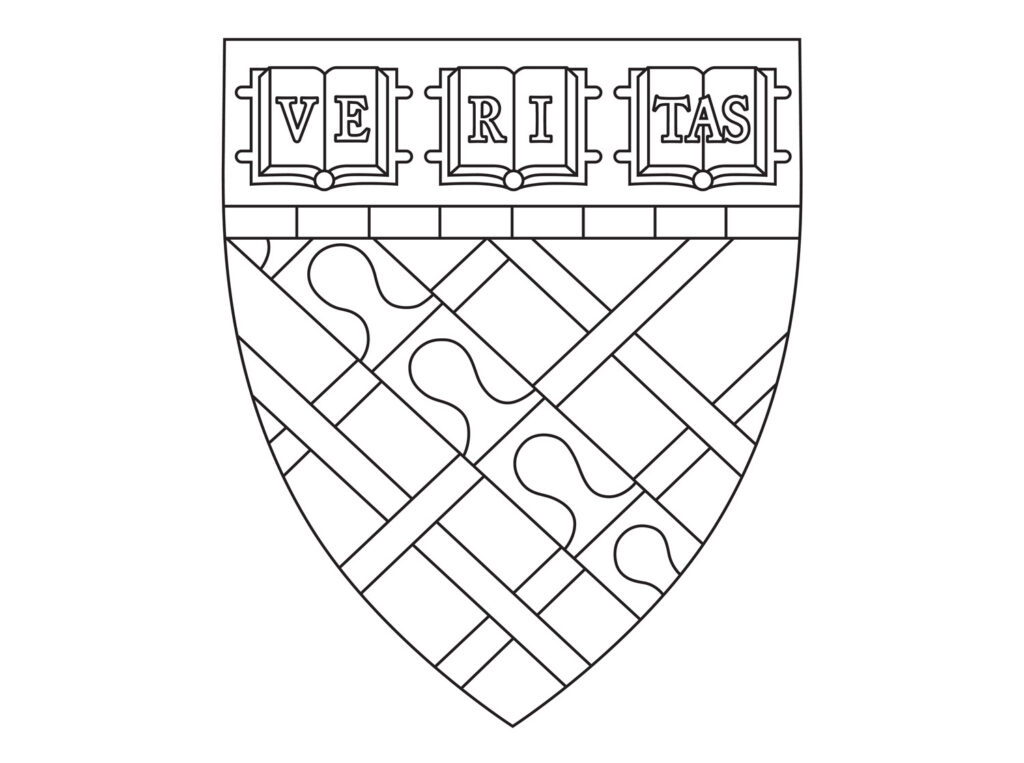
The GSD’s coat of arms is a design element that connects the school to the wider university. Above a row of horizontal bars known as “fillet” in the top register of the shield, the university’s primary device is repeated: three open books adorned with VERITAS, or truth. Yet the shield has a complicated position with the GSD’s identity, at once central to the school’s history and marginalized within its design vocabulary. Alone among the university’s graduate schools, the GSD employs its own primary visual identity separate from the coat of arms. This contemporary design system, which has been updated several times over the decades, in most cases supplants the medieval-style arms (to the occasional disappointment of traditionalists). If the shield is to the era that birthed the university what the corporate logotype is to the modern world, then the GSD projects a dual identity, contending with the values that belong both to the academic realm and to the worldly pursuit of shaping the built environment.
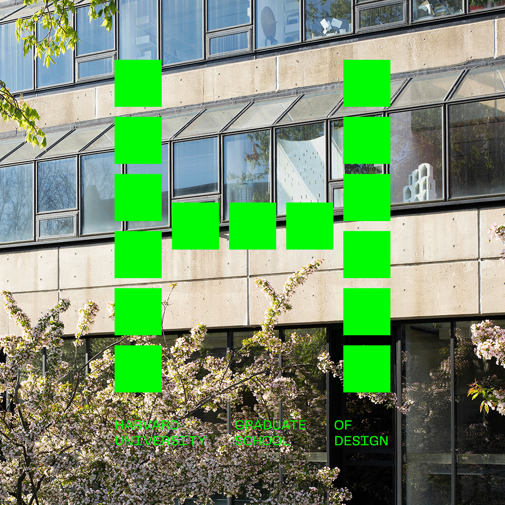
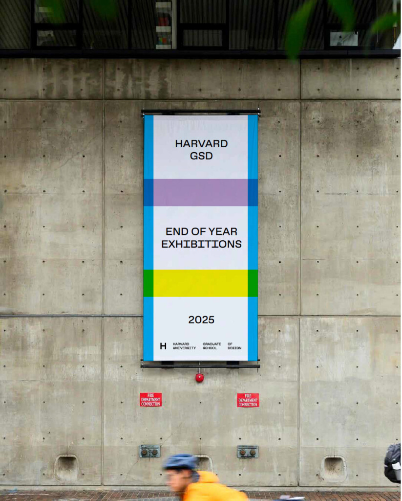
“The shield is an element that has both fascinated and terrified me,” says Chad Kloepfer, art director at the GSD, who led the most recent redesign of the GSD visual identity, introduced in 2023. “But if there was ever a moment to celebrate the shield, a commencement ceremony would be it.” Indeed, the repressed shield makes a roaring return on the banners, tickets, and other accoutrement for this year’s commencement exercises. Elements of the GSD’s coat of arms are enlarged to the point of abstraction and set in dialogue—or, one might suspect, tension— with the gridded “H” logo, related wordmark, and GSD Gothic typeface.

What both systems share is an abiding relationship to the GSD’s history. The “real story” that Rooney transmitted in her memo came courtesy of Mason Hammon, then Pope Professor of the Latin Language and Literature Emeritus at Harvard. Hammon recounts in “A Harvard Armory,” published in the Harvard Library Bulletin, how the Design School’s arms were drawn by Pierre de Chaignon la Rose—an expert in heraldry who sat on the university’s Committee on Arms, Seals, and Diplomas and frequently designed arms for Catholic prelates—in consultation with two major figures of the Design School’s early years: founding Dean Joseph F. Hudnut, and Professor Kenneth J. Conant (Harvard ’15). The former consolidated the Design School into a true institution; the latter’s career-long study of the medieval Abbey at Cluny in France was the subject of a recent exhibition at the school.
This trio devised arms that honor a fourth figure from the GSD’s pre-history: Professor Charles Eliot Norton, who taught art history at Harvard in the late 19th century and, according to Hammon, “must therefore have been regarded as instrumental in introducing the study of architecture at Harvard.” Remembered today through the Charles Eliot Norton Lectures, the preeminent arts and humanities lecture series at Harvard, Norton was the son of a long line of New England settlers who nonetheless retained his family’s English coat of arms, upon which the GSD design is based. Though Hammon affirms the likely authenticity of this heraldry, he also acknowledges that one can never be absolutely sure whether arms long resting in America developed under some Plantagenet’s reign or were concocted by enterprising settlers on the North Shore who found themselves providentially far from the keepers of official records.
Nonetheless, the heraldry evokes an era when graphic design was a matter to be hashed out among noble families and blessed by princes and/or clerics. The gravitas of such designs, then, demanded a precise vocabulary to ensure consistency and legibility, and Hammon’s description of the GSD shield provides some of this arcane flavor:
the arms comprise a red (gules) shield bearing a lattice work (fret) of white (argent). Across the lattice runs from upper left to lower right a band or bend of the fur called vair. This is represented by a silver (argent) band on which from upper left to lower right are three complete or two partial knobs of blue (azure). The lattice consists of a square bounded by narrow strips and with a strip crossing from lower left to upper right, under the bend ‘vairy’. The ends of the strips extend to the edges of the shield, and they are interwoven.
Such daunting verbiage points to the visual density, even busyness, of the Norton/GSD arms. The Kloepfer/GSD identity substitutes the intricate lattice for the minimalist grid, taking cues from the matter-of-fact ethos of the concrete-and-glass Gund Hall. Yet, as Kloepfer points out, the opposing aesthetics of the shield and the “H” are never truly in conflict, but part of a coherent overall system devised to be flexible in the service of diverse needs. “All the elements—logo, wordmark, and shield—can exist together,” says Kloepfer, “and there are moments when those components can exist independently of one another.” The hard-edge “H” on a tote bag is a calling card, signaling an attuned sensibility anywhere in the world, but the shield can do its job when it’s time to pose for photos with the parents.

Rather than staging a collision of disparate design approaches, the blown-up shield for commencement 2026 reveals surprising formal harmonies and shared geometries. This consonance of design vocabularies makes explicit the complementary relationship between shield and logotype immanent in Kloepfer’s contemporary visual identity.

One place, however, where the Norton arms take precedence in this relationship is Harvard Yard, during commencement. The GSD graduates, joining their peers from across the university, will find their place in the Yard marked by the shield alone. Amid a forest of banners adorned with latticework, allegorical figures, and other heralds from professional schools, the refrain VERITAS stands out. The gathering is a ritual expression of a shared pursuit of truth. This black (or crimson)-robed demonstration of solidarity always blunts the competitive edge of university culture. But this year, as the world faces tremendous challenges, the gathering starts to resemble an expression of collective action. “The use of heraldic arms, like the use of academic costume and ceremonial,” Hammon concludes, “is certainly frosting on the academic cake, whose substance is education and research.” Yet, if the symbols and rituals are confections fancifully recalling bygone times, one might wonder how they can serve a global, contemporary university that aims to serve a world in crisis.
Against the charge of anachronism, Hammon argues for Tradition, full stop. The shields have “by now been so long in use that it would be presumptuous to object to them as unsuited to a democratic society and vain to cavil at lack of consistency, at possible heraldic inaccuracies.” At the risk of sounding cavil, we might quibble here with the distinguished professor. The strength of the shield is less in its presumed noble pedigree and repeated ritual use in the Yard than in the actual message it carries, the real story it tells.
Whatever his family tree, Norton was a pioneering scholar and a humanist. By honoring him, the 20th-century thinkers who drew the GSD shield—Hudnut, Conant, and La Rose—honored the pursuit of VERITAS in both abstract and personal dimensions. Their design choice was a wholly modern one. One hopes they might recognize a similar pursuit in today’s GSD. The concrete walls of Gund are no Gothic buttresses, and the “H” logo is adorned with no “vairy under the bend.” But our devices still speak the truth.